The post Warning: Tamper with Vegemite at your peril, writes Robert Drewe appeared first on .
]]>After only six months of Vegemite deprivation overseas in the eighties I began thinking of it constantly. I badly needed a fix. Intending visitors from Australia were begged (eventually commanded) to bring jars with them. No one took my pleas seriously. The Vegemite-less weeks and months ticked on.
At last! From a friend’s luggage appeared the cheery red and yellow label of my childhood! That whiff of yeast! The familiar surface sheen! The strong odour, the salty taste! With my urging, bemused French acquaintances were soon gamely trying Vegemite on their baguettes; wary but polite Californians and Canadians were spreading Vegemite on their rolls. They all said it was disgusting.
It wasn’t that they couldn’t get terribly keen on Vegemite – they thought it the most revolting foodstuff they’d ever encountered. It failed at every level: looks, smell, texture, taste. To them it resembled glistening dark stuff not fit for repeating in a family newspaper much less human consumption.
I felt hurt on Vegemite’s behalf. And Australia’s, too. It was like they’d scorned our beaches, wines, weather, Don Bradman, Sidney Nolan, Patrick White and Phar Lap. I was defensive. I disparaged their stupid foreign breakfast spreads: Marmite and Cenovis, peanut butter and jelly. Chocolate, for goodness sake. Nutella. Any more British derision and I would’ve brought up breakfast black pudding.
Then I tried a calmer, more educational approach. The secret, I tried to explain to them, one passed on from generation to generation of Australians over the breakfast table, was to appreciate the subtlety and delicacy of Vegemite.
This will come as no surprise to those of you who are reading this at breakfast with a trusty jar of Vegemite close at hand. “For a start,” I informed my foreign friends, “Butter first.”
“Then what you do is dab a little bit here and there over the buttered bread or toast,” I instructed. “You never smear it on thickly. That’s a Vegemite no-no. Stifle the natural urge to cover the entire slice up to the edges. Use a light hand, and only the tip of the knife, and just speckle the Vegemite gently and randomly over the toast.”
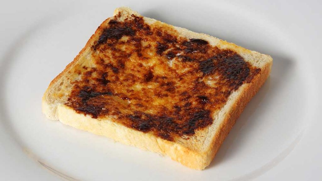
Like this….
Casually, even with a touch of devil-may-care, but serious intent, I demonstrated the approved method. “Like this,” I said. “You mustn’t coat the bread. (My goodness, you’re not painting a wall or laying cement with a trowel!) Try for the desired stippled effect. The acid test is this: if you have correctly applied your Vegemite in sporadic flecks the buttery surface of the bread or toast should still be intermittently visible underneath.”
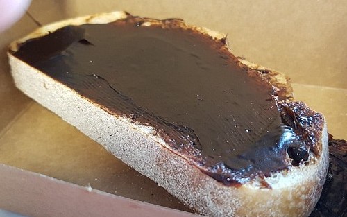
NOT like this…
Of course, I went on to remind them they were dealing with an actual foodstuff and, all appearances aside, not changing the oil filter on their car. I explained après-Vegemite etiquette, passed on sternly from mother and grandmother. To never put a Vegemite-encrusted knife back into the butter (or margarine, if you insist) container.
A question arose and was answered. “Yes, it’s permitted for the various Vegemite dabs and the previously spread butter to run together on a warm slice of toast, to even recklessly swirl and intermingle, as on an artist’s palate. But never allow them to intermix in the butter dish.” Even Australians disliked the look of that, I told them.
Did they take any notice? Not at all. Especially the Americans. They were so used to lavishing peanut butter over everything that they smothered Vegemite on the test slice I provided. Well, they deserved what they always get, a yeasty slap in the face.
Well, we got Vegemite back from them earlier this year when the dairy company Bega bought Mondelez International’s Australia and New Zealand grocery and cheese business.
Nostalgia aside, the reason Vegemite is on my mind this week is that Bega is now attempting to take Vegemite upmarket with a new, more expensive version, Vegemite Blend 17, sold in precious artisanal packaging that includes an unnecessary cardboard box, a gold-coloured lid and a price tag of double that of a traditional jar.
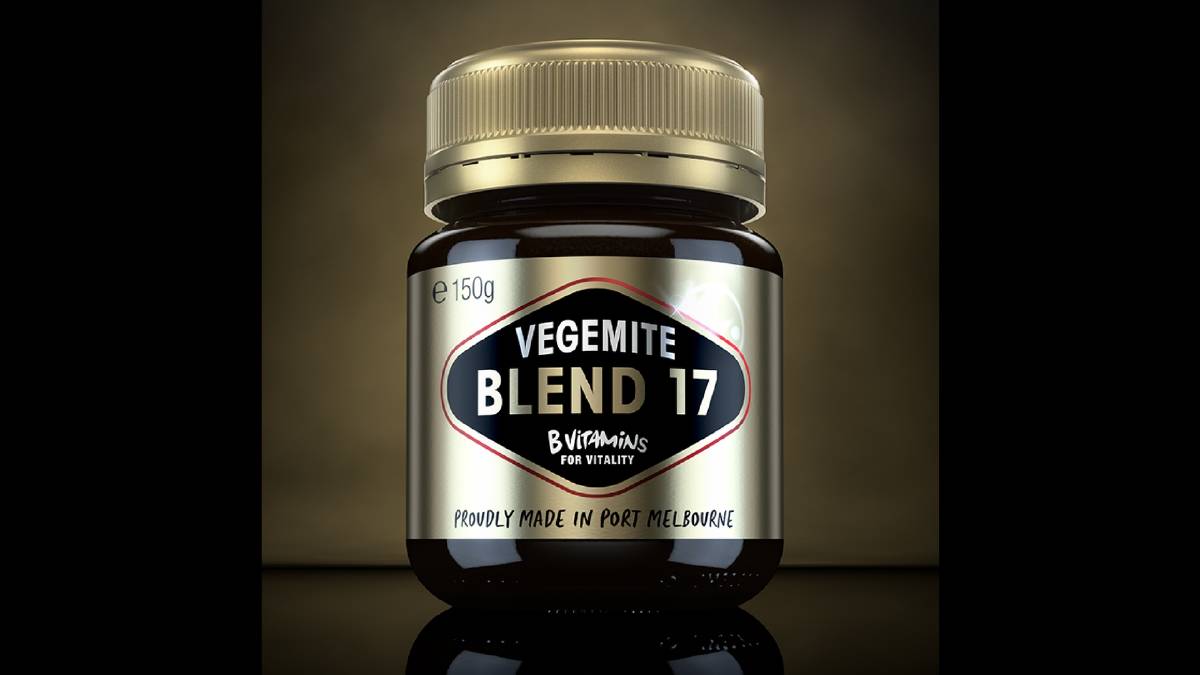
Vegemite Gold – twice the price, but is it twice as nice?
Asked what happened to Blends one to 16, Vegemite’s marketing director, Ben Hill, explained: “The name Blend 17 simply refers to the year 2017 we have released it in.”
Oh, dear. Remember Vegemite Singles, iSnack 2.0, Cheesybites, My First Vegemite, Chocolate-and-Vegemite. All recent Vegemite marketing failures. Tamper with it at your peril. You don’t need a more affluent demographic. Everyone likes it as it is.
Robert Drewe’s latest novel, Whipbird is published by Penguin and is available here: penguin.com.au/books/whipbird
The post Warning: Tamper with Vegemite at your peril, writes Robert Drewe appeared first on .
]]>The post Baby talk – but not from babies, writes Robert Drewe appeared first on .
]]>The other day I heard a hospital administrator on the radio talking knowledgeably about hard-working health professionals who were “speechies”, “occies” and “respos”. These jobs were new to me. It turned out she was referring to speech, occupational and respiratory therapists.
So the Australian partiality for baby talk has now entered the fields of physical and mental health. Mind you, the national love of diminutives was already present in medical circles. For example, we’d always called physiotherapists “physios” and gynaecologists “gynos”. But I hadn’t realised how widely the habit was spreading.
We’ve long used diminutives for such jobs as ambulance driver (ambo), book maker (bookie), bricklayer (brickie), carpenter (chippie), farmer (cocky), garbage collector (garbo), journalist (journo), milkman (milko), musician (muso), politician (pollie), postman (postie), sub-contractor (subbie), tradesman (tradie), truck driver (truckie), wharf labourer (wharfie), and prostitute (prozzie),
Injured at work? Even at “smoko”. Better apply for “compo” (compensation). Or you won’t be able to afford your “reggo” (car registration). Careful you don’t become a “dero” (homeless person).

Interestingly, while everyone knows “chalkie” is the nickname for teacher, it has never really caught on in Australia. For some reason teachers remain teachers. (Until computerisation, “chalkie” also applied to the stock exchange employees who wrote stock prices on chalk boards.)
Until a decade ago I’d never heard “boilie” (for boiler-maker) and “firey” (for fire fighter). Or, until more recently, “cranie” (crane driver); “crownie” (not just Crown lager, but crown prosecutor); “shoppie” (retail shop assistant); and “towie” (tow-truck driver).
Or, for that matter, “Cento”, for the Centrelink office, responsible for unemployment pensions; “povvo”, a poor person; and “deso”, a designated (and abstaining) driver of drinkers.
For reasons known only to Australians, a biker and a surfer anywhere else are a “bikie” and “surfie” here (but never in actual biker or surfer circles).
In Melbourne, you’d know Broady was Broadmeadows, and in Sydney that Parra was Parramatta. In Perth you’d be au fait with Cott, Subi, Freo and Rotto. If you follow AFL or the two rugby codes, you’re a “footy” fan. The other code, known here and in the US as soccer, however, insists on “football”.
Why do we indulge in such baby language (talking about bickies and choccies – and choccy bickies!) long after our third birthday? Why do we eat at Macca’s and buy fuel at the servo? And give prezzies at Chrissie, and drink cuppas and tinnies and coldies, and cook snaggers at barbies (unless we’re veggos and prefer avos), and support the Salvos and Vinnies, and wear trackies or boardies in the arvo?
Because we want to be liked. As pathetic as that sounds, Dr Nenagh Kemp, a senior lecturer in Psychology at the University of Tasmania, says “Australians have an intuitive feeling that these words make social interaction more informal, more friendly and relaxed.”
Dr Kemp’s work on spoken Australian English is helping to build up a more complete picture of what it means to be Australian today, and how choosing to use certain Australian words such as “arvo” and “footy” signals national identity. As she told the Australian Geographic Society which sponsored some of her research, “It sounds obvious: we make words shorter to save us a bit of time and effort. But some diminutives actually make words longer, like Tommo for Tom. And we don’t really save a lot of time by saying barbie instead of barbecue.”
With more than 4300 recorded in our lexicon, Australians use more abbreviated words than any other English speakers. Word lists collected in the past few years show that older Australians are more likely to think of slang with “o” endings (muso, smoko). Young people use these less frequently. Modern trends are to affix an ‘s’ to the first syllable (think “awks” for awkward — which it is).
“If you’re someone who speaks to groups – say, a politician – it could be interesting to know whether these kinds of words make you seem friendlier, or perhaps more condescending,” said Dr Kemp. (Too late, Kevin Rudd.)

“Some people accuse younger generations of spoiling our language with all these diminutives. But the earliest examples are from the 1800s. It’s a long tradition, not a modern laziness.”
Despite that, she can’t see herself adopting some current language trends. “I’m kind of bemused by the trend of saying “mobes” for mobiles, or “totes” for totally. I use some shortened words, but those just sound silly to me.”
For myself, I draw the line at the current words “lappy” for laptop, “Facey” for Facebook, “petty” for petrol, and “devo” for devastated. Anyway, in my teenage daughter’s case, “devo” actually translates as “mildly upset”.
“Deffo”, as she says. “Definitely.”
The post Baby talk – but not from babies, writes Robert Drewe appeared first on .
]]>The post Tea with the Colourman appeared first on .
]]>Early in the 90’s, David Coles moved from England to Australia bringing with him his passion for pigments, his expertise in art supplies and his youthful determination. What he could not know at the time though is that this red continent would offer him something most unexpected and surprising: a desire for new colours.
David’s first factory’s location – on Langridge Street – gave his company its name and, despite rather what he laughingly calls “bohemian” beginnings, hard work and excellence always flourished there. Manufacturing professional quality oil mediums, varnishes and grounds to supply artists with artist grade dry ground pigments and other quality raw materials kept David happy and busy for nearly two decades.
But being the invisible medium of the oil paint world was not his long term dream. Urged on by artists who told David they wanted a paint of the same quality as his mediums, Langridge’s Handmade Oil Colour finally came on the market in 2011. The company started its foray into paint modestly, with 32 on the initial production line, and eight extra added 18 months later. That was only three years ago, and last year they added 16 new colours, with the intention of having 80 colours on their final list.
This May, David is celebrating the first quarter of a century of his ‘young’ company – young in the colour world that is – with a delightful exhibition about pigments, colours and paint making, Chromatopia, opening at Tacit Contemporary Art space in Melbourne on May 31.
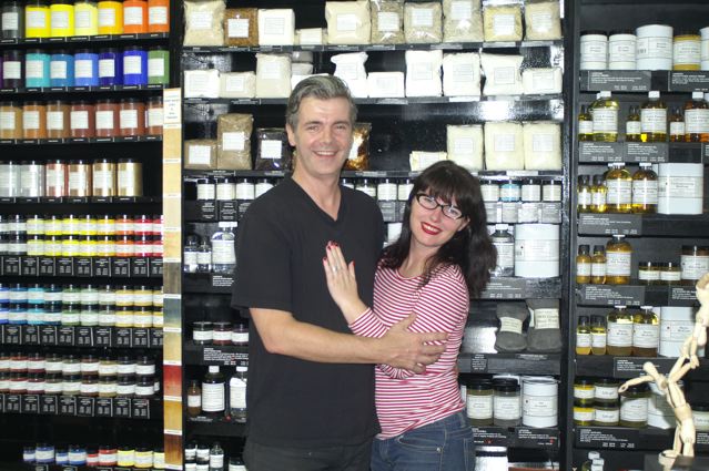
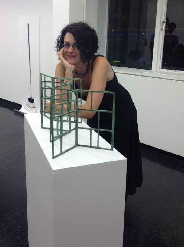
Master Paint-maker David Coles and his artist partner Louise Blyton.
In a perfect match for a paint-maker, David’s partner Louise Blyton is an artist who runs an art store in Melbourne – full of all the Langridge products and the Golden acrylics David distributes here in Australia. Their enthusiasm for their projects and creations is infectious – and I’m increasingly intrigued, as they talk about their love of paint, about the title of Master Paint-maker. It certainly isn’t an honour bestowed on everyone. David tells me that the name reflects the dedication involved with the formulation of paint from scratch. “Being a Master Paint-maker as well as the founder of Langridge Artist Colours, I’ve grown very sure about following my philosophy of what paint should be. For me paint should not only have the highest pigment load possible to so that artists can get as much colour of the paint as possible, but it should also have a certain feel,” he says.
As he describes the quality of paint, it sounds almost like a chef describing a cooking method or food. “The paint is going to be reflective and honest about the way the pigment actually is and creates certain qualities. You have some colours that are naturally soft and quite fluid. Some which are quite buttery,” he explains. “Some are quite stiff, some clotted. It’s the pigments’ action upon the vehicle used creating that. You don’t see that with most of the other paints out there because they use some additives, mostly stabilizers, in quite large quantities which, in essence, homogenizes and evens out the natural qualities of each colour. I think that a pretty important part of an artist’s craft is understanding how paints operate slightly differently from colour to colour because they reflect what the pigment is actually all about.”
Despite the title however, it’s not exactly a degree you can go somewhere to obtain. This title is really learned on the job. “There’s nowhere you can go and learn to become a Master Paint-maker,” says David. “I learned a lot of my craft when I went to work for Roberson & Co. back in London in the 80’s, but in the end, I really learnt it on the mill. When you’ve got wads of colour coming at you from the triple roll mill, you start to learn. For example, with modern colours where you have to tease the colour, the pigments need to be separated from each other much more gently whereas the older inorganic pigments, like the Cadmiums and the Cobalts, are much easier to disperse – and something like Zinc White, which is a very soft pigment, needs hardly any work done to it to actually make it into a dispersed paint. And when we talk about dispersion, I’m talking about separation of the pigment particles evenly throughout the actual vehicle so that all the pigment particles are separated from each other and coated evenly in the minimum amount of oil possible to make it into a paste. Which is what we call paint!”
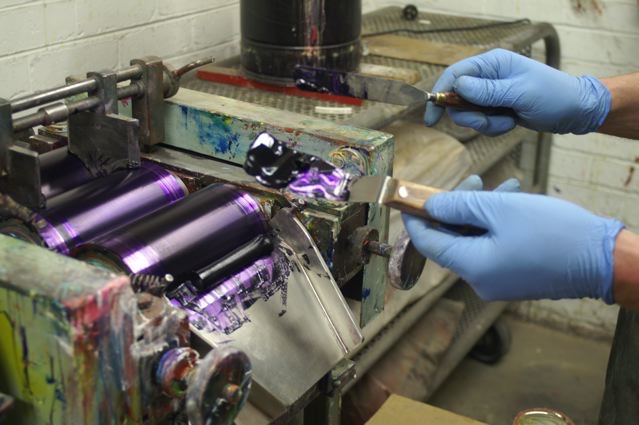
The process of making paint at the Langridge factory.
If there is a range of colours that are perhaps more difficult than others to work with, it’s the earth colours. “Some of my children are very obstinate,” David laughs. “The Umbers are very naughty. They’re thirsty pigments so they need a lot of oil. Our Siennas are naturally of a gritty consistency and that’s not because we’ve under-milled them but because that’s the nature of Sienna pigments. The Earth colours, because they’re naturals, have their own real individual qualities.”
I’m intrigued by the use of the word ‘our’, but as David explains he now has long term relationships with the major pigment manufacturers around the world. “I buy from the Germans, the British, the Americans, the Taiwanese, the Japanese, and we select pigments that are built to the specifications we need as artists. The most important factor is that they are not reactive with other painting elements, like solvents, that there is no solvability etc. and that they are highly lightfast. Also that, when they are dispersed, they have a working quality that makes a paint artists can work with,” he says. “There are now a lot of pigments available that are surface coated. For example, these days most Titanium White pigments have some kind of surface treatment which allows it to be dispersed in different types of vehicles for different applications. We’re offered a vast variety of them and so we have to be ultra careful about what we choose. It would be very easy for someone to be waylaid and pick the wrong pigment. You have to know a fair amount about chemistry. Not that I’m trained as a chemist, I trained as an artist. So my starting point is always – are these colours artists will want to use?”
Originally David had imagined that he would become an artist. “In fact,” he says, “I don’t think I had any doubts about that – actually I still am an artist. I have a studio, I still go in the studio although not as much as I used to, but my art informs very much what and how I make the things I do. Also my conversations with fellow artists don’t stop at selling them or supplying them with materials, it’s a constant ongoing conversation. All my friends are artists. I go to their studios, gallery openings, and over dinner at home we might start talking about their painting. I’m very open to helping artists because it feels, naturally, the right thing to do.”
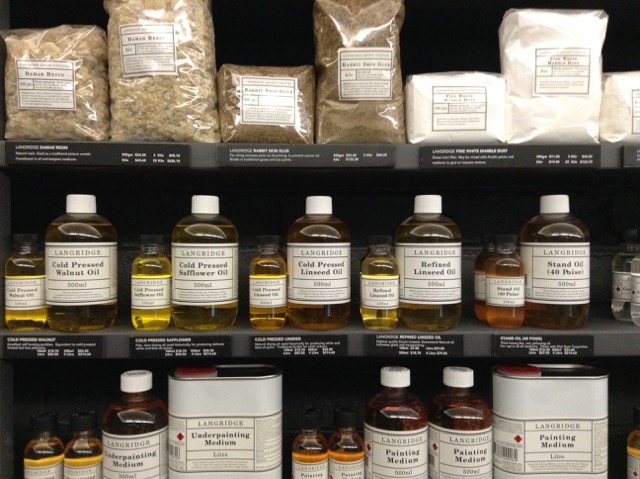
Mediums of all kinds – but always of the highest quality – all made with non-yellowing Linseed Oil.
His Australian career came about by accident when he first visited Australia on a holiday while he was working for an art retailer in the UK. “I became aware of what was available to Australian artists. Obviously there were a couple of Australian manufacturer’s brands here. Having worked for Roberson & Co. and in their venerable art materials store in London, Cornelissen & Son, I knew a lot about art materials and the benefits/negatives of each raw material that goes into a manufacturer’s formulations and products.”
One of the biggest issues for David remains the use of linseed oil, which he uses as a binding oil for paint. “It’s magnificent,” he says, “but obviously it’s kept to an absolute minimum because used excessively, particularly in mediums, it promotes yellowing. The mediums that I could see here were basically, unfortunately, detrimental to the artists’ practice. So that’s why all of the Langridge’s fluid mediums are based on stand oil – polymerized linseed oil because it’s a non-yellowing oil. So I very quickly realised there was a gap in the market for a world-class medium for artists. Before I came back out here, I knew what I was going to do: set up an artists’ products manufacturing company in Australia. Even then I knew I wanted to make paint.”
David began his company by formulating mediums, rather than the more usual manner of creating paints for the simple reason that it was all he could afford to do at the time. “It took me seven years to be able to slowly find and buy all the machinery needed to start making paint,” he tells me. “The first mill I bought was a small mill. We still use it in the factory to make very small batches and often now trial batches. But it took me many years to be able to afford to get to that stage. So I started making oil paint mediums, which I formulated myself from scratch, again knowing what I wanted to get out of a medium for myself and what I knew was important for artists.”
Listening to David describing paint and pigments is fascinating. “Of course,” he says, “pigment is pure colour. Some disappear and we introduce more colours but, as a general rule, we stock and sell about a hundred pigments here because some artists want to make their own paint and because they are so delicious in their nature as pure colour. In the paint something has already been denatured. It’s colour with a binder and depending on the binder, it can alter the optical vibrancy of the paint. Ultramarine is a classic. You can see the pigment vibrate but when mixed with oil it becomes very dark. You have to add white to it to start to see that light come back into it. I’ve always been in love with pigments anyway. I remember when I was around eleven and my mother had opened up an art shop in Henley where I grew up, and one Christmas she gave me a set of pigments, just little 30ml pigment jars and it was for nothing else except to be able to look at them. Like jewels.”
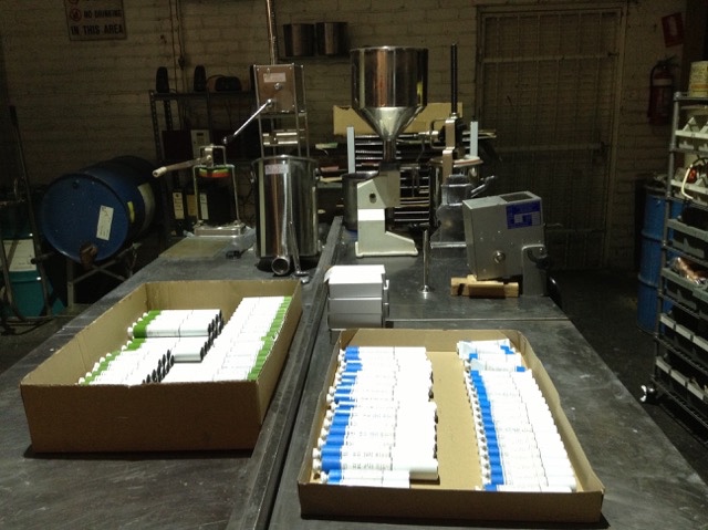
Empty tubes waiting to be filled with Langridge paint.
David has also always been interested in the history of art materials. “I’ll experiment by making something using a 14th or 15th century recipe… at the moment I’m making a traditional walnut ink made from their husks,” he says. “They’ve been fermenting in the pot for about two years now and the fermentation breaks down the sugars which creates a darker colour. I’ve also made a whole set of traditional lake colours from dyes. Things like Brazil wood and turning it into pigment and in the same vein I want to make some genuine madder but these are not commercial exercises this is purely out of curiosity and to understand I suppose how pigments used to be made and probably from that realise over again how incredibly lucky we are now. I’ve always been a big believer in this idea of science and art, technology and art actually, working hand in hand. I mean the history of technology is always written out of the history of art in regards to why artists started to paint in a particular way. Often it has to do with a technological breakthrough not an aesthetic or cultural breakthrough.”
What David is constantly striving for is a quality of paint that can compete with the best in the world. And that, in turn, feeds into his desire to create paints that reflect Australia. “Do I think there’s room in the world for another paint? There are already quite a lot of brands out there,” he says, rhetorically. “Where I think Langridge can make a difference is because of my interest in these modern highly chromatically intense colours. Creating a palette that reflects the Australian light in a way that light floods and energises the colours that it strikes and which comes from the dryness of the continent. There’s very little moisture, there’s very pure light and the scale of the skies are enormous. It doesn’t really afford the opportunity for much shadow. And when you do get shadows, the shadows vibrate as well. They become violet and vibrate that way.”
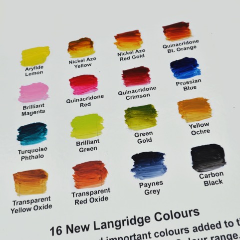
Sixteen beautiful new colours – designed to capture the Australian light.
He is determined to offer an Australian palette in his range. “I suppose for example, that Zinc Blue attempts to fill the colour space that used to be filled by the old Manganese Blue which is a pigment that has not been in production for almost twenty years,” he says, “and that particular blue is very relevant to the Australian sky and Australian water, especially ocean water which has that kind of brightness and again that lack of moisture, or perceived lack of moisture to the eye because of the blueness of the sky as it strikes a liquid material! It’s the same with our Cold Brown Oxide. It’s a blend that replicates a colour very useful for artists, an old colour that was Cassel Earth or Van Dyke Brown. Those pigments unfortunately have strong problems with regards to drying rates, they’re very erratic. So, once again, I wanted to create another blend for this colour so useful to artists in particular for creating receding shadows, etc. without those drying problems. Of course as we go to the 80 colours, yes there is going to be more blends. And then I’ve got to be extremely careful about why I’m making them. That’s why I’m interested in what we call our brilliant range. We already had Brilliant Pink, which is almost like a hot bubble gum pink and have proceeded with a Brilliant Magenta and a Brilliant Green and we’ll continue to expand that range. The philosophy of that range is to offer the kind of vibrancy of a fluorescent pigment, but highly lightfast. So, again, these non-real or unrealistic colours are there because I know artists find them very useful.”
Talking with David it’s easy to feel that there was a sense of destiny to his arrival in Australia and to his career. “Langridge did have a sense of destiny unfolding,” he agrees, “a whole set of coincidences, accidental meetings, that led to me very easily settling here. And it’s interesting about you mentioning it being an old continent because Australia is of course the oldest continent with the oldest continuous civilisation in the world, and it’s something that I’ve thought long and hard about in regards to Langridge: what is our relationship with that part of Australian culture? I’m not working with a traditional aboriginal palette but we have a lot of aboriginal artists who buy our pigments and some of the very bright colours. At this point in time though, most of the indigenous artists I’m connected with work in acrylic paint not in oil. So there isn’t immediately some kind of connection to the actual materials. For the pigments we have a constant interaction and dialogue with communities West, up North and in the Centre. Our oil paint is not something they are particularly interested in at this moment. Acrylic is probably much more sympathetic to their painting style: waterborne, fast drying.”
The rich colours are almost a painting in themselves…
Which brings us to the question of whether, in this age of fast-changing technologies, something as ancient as oil paint can survive. David is sure it can. “Oil paint is here for the future absolutely. I’ve made oil pastels, oils sticks, compressed chalks, charcoals, gouache, drawing inks, even shellac based ones…I do it more out of a personal interest, a curiosity. I would love to make commercially soft pastels but, again, there is so much to be done with oil paints I’m not quite sure I’ll ever find the time. Not just the oil colours themselves, I’m constantly inventing and formulating new mediums and new products when I see a gap in the market. A possible new tool for painters. I have just developed a more fluid medium, which has a more slippery quality than some of our existing ones, and a high impasto medium. We’ve been experimenting with some glass bead and we’ve just released a new encaustic wax… a modern formulation of a very traditional recipe. Encaustic, at this moment in time, is back in favour. We have a lot of artists interested in working as encaustic artists. All the materials available had to be brought in from overseas but I knew we could produce here a product as good, if not better, than those imported products. And again because I worked with encaustic 20 years ago, and on and off since that time, I do understand the working qualities and what this product needs to be, as a tool for artists. So far the feedback from encaustic artists with lots of experience themselves has been extremely positive. We do believe we’ve created something quite unique. Something we could even launch onto a world market and it fits, of course, beautifully into our pigment colours so in a sense it closes the loop all the way back to the very beginnings of Langridge. 1992 to now. A completion of the first circle really.”
Photographs: Sabine Amoore Pinon and David Coles
Sabine Amoore Pinon runs Still @ the centre, an art store in Byron Bay, and is a fan of great art materials. Check out her supplies here: https://the-centre.com.au She also writes a blog about her interviews with colour men and women all over the world. Follow her on inbedwithmonalisa.com
‘Chromatopia’ opens on May 31-June 18 at Tacit Contemporary Art Gallery – 312 Johnston St, Abbotsford Victoria.
The post Tea with the Colourman appeared first on .
]]>The post The stars come out for Splendour 2017 appeared first on .
]]>The stars have aligned for Splendour in the Grass Music & Arts Festival. Organisers have dropped possibly the best line-up since 2010, featuring a blockbuster cast of rock royalty, electro pioneers and hip hop innovators.
Queens of the Stone Age, LCD Soundsystem, The xx, Royal Blood, Sigur Rós, HAIM, Two Door Cinema Club and Father John Misty lead a stellar international cast. Two Splendour 2017 exclusives: ScHoolboy Q and Future Islands will feature in their only Australian shows.
On the Australian front, Bernard Fanning, Peking Duk, Pond, The Smith Street Band, Cut Copy, Bag Raiders and King Gizzard & The Lizard Wizard are set to perform.

English band The xx have been described as ‘sparse and chilling’.
In all, over 100 acts will perform over three days across the Amphitheatre, GW McLennan tent, Mix Up and Tiny Dancer stages.
Tickets to the festival sold-out within an hour of going on sale this week. Splendour co-producers, Jessica Ducrou and Paul Piticco, were thrilled by the response but were quick to show their love for locals who had been devastated by the recent floods that hit the region.
“Once again we have been overwhelmed by your love and enthusiasm for Splendour. We can’t wait to bring you another awesome show,” they said. “Our thoughts are with all those in our local Northern NSW community that have been devastated by floods over the past week. We will be announcing a fundraising initiative soon to assist with the recovery. In the meantime, we’re sending you all our love.”
For those that missed out on tickets, Moshtix provides a resale facility that will be available from Monday, May 8.
But Splendour isn’t only about great music. Splendour in the Grass will also play host to an innovative arts and cultural program that will showcase some of the best arts practitioners from Australia and around the world. The 2017 program will once again transform North Byron Parklands into a contemporary outdoor art space, featuring live art, happening performances, installations and more.
SPLENDOUR IN THE GRASS 2017
Friday 21 July, Saturday 22 July and Sunday 23 July
North Byron Parklands
Tweed Valley Way, Wooyung (15 mins north of Byron Bay)
splendourinthegrass.com
SOLD OUT
THE XX • QUEENS OF THE STONE AGE • LCD SOUNDSYSTEM • ROYAL BLOOD • HAIM • SIGUR RÓS • SCHOOLBOY Q (ONLY AUS SHOW) • VANCE JOY • TWO DOOR CINEMA CLUB • PEKING DUK • RL GRIME • BONOBO • FATHER JOHN MISTY • CATFISH AND THE BOTTLEMEN • TASH SULTANA • PAUL KELLY • STORMZY • KING GIZZARD AND THE LIZARD WIZARD • GEORGE EZRA • FUTURE ISLANDS (ONLY AUS SHOW) • BANKS • BERNARD FANNING • DUNE RATS • CUT COPY • ÁSGIER • ALLDAY • MEG MAC • RAG‘N’BONE MAN • THUNDAMENTALS • LIL YACHTY • SAN CISCO • CLIENT LIAISON • REAL ESTATE • DAN SULTAN • VALLIS ALPS • D.D DUMBO • MAGGIE ROGERS • TOVE LO • POND • BIG SCARY • THE SMITH STREET BAND • OH WONDER • A.B. ORIGINAL • DOPE LEMON • THE KITE STRING TANGLE • YOUNG FRANCO • JULIA JACKLIN • KINGSWOOD • AMY SHARK • LUCA BRASI • THE LEMON TWIGS • VERA BLUE • SLUMBERJACK • BAD//DREEMS • BAG RAIDERS • TOPAZ JONES • MIDDLE KIDS • OCEAN GROVE • CONFIDENCE MAN • BISHOP BRIGGS • LATE NITE TUFF GUY • JULIEN BAKER • KILTER • LANY • HOCKEY DAD • KIRIN J CALLINAN • AIRLING • COSMO’S MIDNIGHT • GRETTA RAY • MOONBASE • THE PEEP TEMPEL • TORNADO WALLACE • THE MURLOCS • MALLRAT • LUKE MILLION • THE WILSON PICKERS • ROMARE • JARROW • GOOD BOY • KUREN • ONEMAN • WINSTON SURFSHIRT • SET MO • HWLS • HARVEY SUTHERLAND & BERMUDA • CC:DISCO! • ENSCHWAY • DJHMC • NITE FLEIT • ALICE IVY • WILLOW BEATS • WILLARIS. K • MOOKHI • TRIPLE J UNEARTHED: WINNERS PLUS… SWINDAIL • DENA AMY • ANDY GARVEY • PLANÈTE • SAM WESTON • SUPER CRUEL • CHRISTOPHER PORT • LEWIS CANCUT • KINDER
Maggie Rogers: an American musician, singer-songwriter, and producer from Easton, Maryland. Her song ‘Alaska’ shot her to fame.
The post The stars come out for Splendour 2017 appeared first on .
]]>The post Christine Porter: Shadowing Tom Roberts appeared first on .
]]>‘Shadowing Tom’ is a major body of work for this Lismore-based artist. The paintings are about the shed at ‘Newstead’ near Inverell, where Tom Roberts painted his iconic painting: ‘The Golden Fleece’. Porter worked for two years creating paintings, a suite of ten drypoint etchings (engravings on perspex) and a series of mixed media wall sculptures.
The Inspiration
It’s sometime in the nineties. I’m on the New England Tablelands of New South Wales. I’ve been on the road for several hours now and my mind is in that sort of driving trance where I’m noticing the world, but not giving it all my attention. I clock advertising signs and property names, buildings, sheep, cattle: elements of the ever-changing beauty that is this part of regional NSW. It’s one of the things I enjoy about my career as a full time artist: a career that has taken me from Tasmania to Mt Isa, much of it along roads like this.
Some say mine is a traditional art practice, but it’s about ideas too. I tell visual stories of rural Australia, specializing in the sheep and wool industries. I make artwork about that iconic Australian building: the shearing shed, whose slow disappearance from the landscape maps the decline of wool’s importance to general Australia.
That day, back in ‘96, I’m not even completely aware of reading the property sign saying “Newstead”. But my mind, of it’s own volition, connects it with Tom Roberts’ famous painting Shearing at “Newstead”, also called The Golden Fleece.
Over the years, although other details of that trip fade, I remember the sign, and return to the idea of it often. I imagine adding that shed to the growing list of shearing sheds I’ve painted. For years I couldn’t even be sure the sign I’d seen at a glance was the same as Tom Roberts’ shed: there are lots of properties called “Newstead”. It would be years before I found out it was, and years more again before I would pluck up the courage to make the tentative calls to find out if a painting project was an option.
2 Plucking up the courage – how many artists does it take to make a phone call?
I’d painted my first shearing shed in 1984. By 2013 my practice had evolved to the point where I’d been invited to sheep and cattle stations all over rural Australia as their own personal artist-in-residence. I spend time on the property, with the resulting paintings and etchings exhibited within the family, then shown later to a broader audience. It’s a very personal and satisfying way to share my work.
I had paid attention to career steps too, in that time. I had a university degree in visual arts and travelled to the UK on an art Fellowship. I had two etchings in the National Gallery, won lots of prizes and painted some of the iconic sheds of Queensland: “Isis Downs”, “Barcaldine Downs”, “Umbercollie”.
Overlaying this was an intense happiness with the subject that had become the mainstay of my practice. Things were going along nicely, but the next shed on my list would feel more important than any I’d ever painted before.
In summer 2013 I’d been in the Inverell area and had been offered an exhibition at the gallery there. Wanting local sheds to be part of this show, the time seemed right to consider that bucket list of all bucket list items: the shed at ‘Newstead’. I was nervous about making the first call. Mostly people contact me to organize a project. I wasn’t completely sure that I had the experience to do it justice, nor how I’d be received.

Christine Porter’s notebook
3 The on-site research
Finally I was given special permission to visit.
I spent several days late 2014 drawing on site at both the original shed – that of Tom Roberts’ fame – and the “newer” shed which is still more than 100 years old. I did prep drawings for what would result in 30 watercolour paintings of both sheds – a major body of work. Such was the significance of this place that for those few day I was very aware of the shadow of Tom Roberts reaching me from 120 years ago.
It felt weird painting there. I was constantly reminded about how much the shed had changed since his time: “It doesn’t look like that now” I heard myself muttering. Drawing the shed as it was, I was re-seeing his shed. But neither could I un-see what he’d shown us already. Already this project was more than just a simple visual discussion. I needed more information.

The painter on site, sketching where the painter once sketched…
4 Off–site research
The Golden Fleece is on permanent exhibition at the New South Wales Art Gallery in Sydney. I made a special visit. I read every book in the library about him, and searched the internet. I discovered archives, references and other people’s writing. Then came the most exciting opportunity.
With forms filled out, and my heart in my mouth, I was given access to Tom Roberts’ actual sketchbooks at the State Library of NSW. I sat in the special collections section, behind the glass wall, at the back of the main reading room of the Mitchell Library, looking at sixteen small working sketchbooks, thumb-printed and dirty from use. It was an astonishingly personal experience to be able to handle these small books that could have been created last year, rather than a century ago. It was as if the artist himself was sitting next to me in that hallowed space, telling me about the dust and excitement of the sheep yards and his plans for paintings I knew he’d completed.
I’d found the man behind the masterpiece.
I travelled to Canberra to see The National Gallery’s blockbuster exhibition January 2016, and saw his work in other major collections there. Shadowing Tom began to feel a lot like stalking Tom, but the more I learnt the more my fascination grew.
Christine Porter in front of The Golden Fleece by Tom Roberts at the Art Gallery of New South Wales.
5 In my own studio – the finished paintings
Over a six month period in 2015 and ‘16 I settled down to make paintings. Using the prep sketches and notes I’d made on site, as well as some photographic references, I developed the paintings of both shearing sheds. This part of the project is typical of the work I do. I make artwork about what a shed looks like from the outside in full sunlight, as well as interiors where the patterns of light are created by skylights and doorways. These paintings are all watercolour on paper, from 15cm square to much larger works.
I was happy with the results, but I wanted to tell the other story too – about how it felt to visit “Newstead” – making artwork that so closely shadowed Tom Robert’s iconic painting.
6 Shadow boxes and printing them
I’d recently learnt how to make boxes from Perspex. These new skills gave me a chance to eplore some of the ideas that were developing about my visit.
I chose ten images from my sketchbook that I scratched, dremmelled and sandblasted onto small Perspex sheets, creating areas that were transparent, translucent and opaque. I then constructed boxes with the Perspex drawings as the face: on the back wall of the box I placed a postcard of The Golden Fleece. The audience literally had to look through my drawings to see his image.
My drawings changed the way the postcard version of his painting could be seen, just as his painting impacted on what I saw, 120 years after he’d been there.
Before I made the boxes I printed from the engraved surfaces, creating a small edition of each of the ten images. In this exhibition they’ll be installed with the parent work, but they’ve already been exhibited in their own right. These artworks represent how we’re distant from the Tom Roberts version of sheep and shearing, and even of making art – and with each year becoming even more distant. Eventually the image of The Golden Fleece will become completely meaningless to most people, it’s symbols already losing relevance for so many Australians.

Christine Porter: ‘Shadow Box IX’; engraved perspex box with gallery postcard, 19x15x5cm (top). ‘Locked’ 2016, drypoint 18.5×14.5cm (bottom).
7 The exhibition – installing a journey
As I write, in the steamy heat of a northern rivers summer, it’s late 2016. This body of work, now entitled “Shadowing Tom” is in the final stages of preparation for its exhibition in Inverell, in February and March 2017.
If art is about telling a story then this is a story of a journey with many layers. It’s not just the story of a shed, on a hill, with a past. It’s not just the story of two years researching and making artwork about this site, nor is it just about the germ of an idea that took twenty years to be realized. Perhaps it’s the journey of a governess on a cattle station near Charters Towers painting her first shearing shed in 1984, then thirty years later sitting in one of the most famous shearing sheds in the history of Australian art, wondering how she got there.
More than likely it’s the journey of that artist and her art practice honouring the legacy of an unintentional mentor and exploring the implications of making artwork under the shadow of his iconic vision: celebrating the growth of her own creative voice, influenced by her mentor but not eclipsed by him.
Exhibition Details: Inverell Art Gallery 5 Evans St Inverell NSW
February 25 – March 26, 2017
official launch. 5pm Saturday February 25th, 2017
$10 entry, cash bar. RSVP to the gallery.
Open normal gallery hours, except for the last day, Sunday March 26, when gallery is open until 2pm, coinciding with the “Opera in the Paddock” weekend.
www.inverellartgallery.com.au
www.christineporter.com.au
The post Christine Porter: Shadowing Tom Roberts appeared first on .
]]>The post Robert Drewe on summer secrets, sharks and seagulls appeared first on .
]]>Ah, the hint of warmth in the air, that first gentle zephyr, reminds us that the season Australians like to celebrate is almost here again.
Summer: you’d think we’d invented it. Was there ever a people who embraced summer with such idealistic and sensual fervor? Who constantly wrote about it, painted it, photographed it, waged political battles over it? Who mythologized it?
Rhetorical questions. And of course when we think of summer we automatically think of the beach. And when we think of the beach nowadays, especially on the north coast of NSW, our minds turn to sharks, and suddenly we’re not quite as carefree about summer as we were ten years ago.
Regardless of our personal take on the shark attack controversy (and how strange that the words “shark” and “controversy” should ever occur in close conjunction, or that sharks should become a political issue) most of us agree that this question is so far unsatisfactorily resolved.
Sharks are just one summer puzzle for me. I’ve long thought about other slightly less serious beach questions. 1: Why does beach sand squeak underfoot? 2: Why do so many seagulls have one foot missing? 3: Most importantly, why, on entering the sea, does one need to pee?
Three different scientific reasons are given for the noise your feet make on the hot, dry sand as you make your way (if shoeless, then hurriedly, and in pain) from the shore to the car park and the ice-cream shop.
The first theory is that sand squeaks underfoot if the individual grains are dry, rounded and spherical, of similar size and free of pollution, moisture and organic matter. A layer of grains moves in unison over the grains beneath it, producing the squeaks. Even small amounts of pollution or moisture reduce the friction enough to silence the sand. Wet sand doesn’t squeak.
Other squeaking-sand theorists say that thin layers of gas trapped and released between the grains act as percussive cushions of vibration – hence the squeaks.
Nonsense, say a third group. The squeaks are produced by friction between grains coated with dried salt. I favour the dried-salt theory, if only because a boat’s deck – with no sand around – can make similar squeaks underfoot.
The case of the peg-legged seagull meets with even more varied responses. Some wildlife experts insist that one-legged gulls are just standing on one leg to rest. Yes, two-footed gulls can do that. But I’m wondering about the one gull in every flock that has two legs but lacks a foot and limps along on a stump. Visit any beach today and you’ll see this one.
Other experts say the disabled gulls have had their feet caught in fishing lines, nets or general rubbish. But who has seen this occurring, and in such numbers? And in environments miles from any dump or habitation?
Most children’s reasoning: that the gulls’ feet are nibbled off by fish while floating on the surface seems just as relevant. As does my son’s grim theory. He says seagulls are the ultimate beggars. They bite off one of their feet so you’ll feel sorry for them and throw them more chips.
And now for the important third question. Next time you’re at the beach, watch your fellow swimmers as they enter the water. They’ll dive under a wave, swim a few vigorous strokes, then stop, stand waist-deep, maybe clear their noses, and gaze nonchalantly at the horizon for a minute or so.
That’s the peeing phenomenon in action. And when you hit the waves, you’ll probably do the same. No need to worry. The ocean has the same effect on everyone, males and females, especially when it’s colder than the surrounding air. It’s the shock of the temperature change. Body temperature drops dramatically and you feel the necessity to expel urine to equalise things.

Incidentally, did you know that more Australians drown in ocean rips every year than die as a result of shark attacks, floods, cyclones, bushfires, snakes, spiders and all of the country’s other natural calamities combined?
According to Surf Life Saving Australia, two out three beachgoers who think they can identify a rip are wrong: they can’t. And contrary to popular belief, only 15 percent of swimmers caught in rips are overseas tourists. Most who die in rips are Australian males aged 15 to 39.
More than 160 people have drowned in rips around the coastline in the past 10 years. The SLSA says these numbers are a gross underestimate because viagra natura they were only confirmed when a witness saw how the victim was swept away. Many rip drownings occur when a person is swimming alone.
In newspaper terms, a rip drowning rates four paragraphs on page 11; a fatal shark attack gets the front page. But you knew that already.
The post Robert Drewe on summer secrets, sharks and seagulls appeared first on .
]]>The post Dr Libby brings her latest book on women’s health to Bangalow appeared first on .
]]>There’s not that many doctors in the world that are so famous they don’t even need a surname – Dr. Phil springs immediately to mind, but there’s also another doctor, one rather closer to home, and that’s Australian-born, New Zealand-based Dr Libby, (aka Dr Libby Weaver) whose books on the powerful connection between how we live and our bio-chemistry have consistently shot her to the top of the non-fiction bestseller charts.
Biochemistry was an early passion for Libby. When she was only 22, she decided to cover her bedroom walls with butcher’s paper, write down every chemical reaction she knew, and memorize them. Not, perhaps, you would have to say, your average twenty-two-year-old’s hobby.

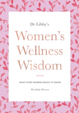
The author of nine books, Accidentally Overweight, Rushing Woman’s Syndrome, Real Food Chef, Beauty from the Inside Out, Real Food Kitchen, Sweet Food Story, The Calorie Fallacy and Exhausted to Energized. Dr. Libby’s latest book, Women’s Wellness Wisdom, is perhaps the most complete book ever published on the relationship between women’s minds, bodies and spirits, our connection to our environment, and the notion that an holistic lifestyle is actually the only lifestyle we should be living. On the subject of the importance of nutrition, Dr Libby is brutally frank. “The reality is we cannot compromise our nutrition and expect to still have fantastic health,” she says.
It was her belief in the importance of biochemistry that led her to do her PhD in the biochemical and nutritional factors in children with autism – which has had enormous impact on how the condition is treated. It was the beginning of a life-long career looking at the impact of how we live on our health, and Dr Libby is a firm believer that no matter how busy our lifestyles, no matter what our problems, transforming the way we eat and the way we live, can revolutionize – not just our health, but our relationships, wealth, and general wellbeing. “If you think about ho women’s health has been judged, it’s usually weight,” she says. “I think is completely wrong. Energy is the true currency of health.”
The book is divided into four major sections: Eat, Body, Mind and World. Within those sections are chapters that cover everything as diverse as filtration for our kidneys and liver; why we have ‘big’ conversations at night; living longer; hormone disruption and understanding menopause. Beautifully laid-out with luscious photographs, the book is enticing. Dr Libby writes accessibly about complicated subjects, and her book can be read and enjoyed at numerous levels, with everything from tips on freezing foods to the chemical properties of herbs, explanations and remedies for skin conditions, hair-care, thyroid and more.
The expression that behind every great man is a great woman, could be reversed in Dr. Libby’s case – but perhaps supports the theory that two is better than one when it comes to building a business, or one person supporting their partner’s vision. Former Auckland Racing Club CEO Chris Weaver, met Libby at a lifestyle retreat in Queensland, and was so impressed on how she spoke about the need for people to understand the causes behind weight gain, that he spoke to her afterwards about how she could promote her message to a wider audience.
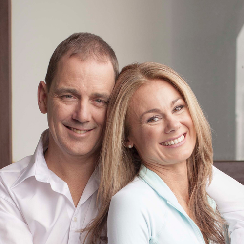
Dr Libby and Chris Weaver.
It wasn’t long before the two had formed a complete partnership, and as a result Libby was able to throw herself whole-heartedly into the business of holistic health, becoming a world-wide renowned speaker, nutritional biochemist and author.
Dr Libby is appearing at the Bangalow A&I Hall this coming Monday, September 19 at 7.00 pm as part of her ‘Surviving to Thriving’ tour.

Date: Monday 19 September, 2016
Where: The Hall, Bangalow A&I Hall – Station Street, Bangalow, NSW 2479
Time: 7:00pm – 9:00pm (doors open 6:15pm)
Tickets: $39.95 (pre-sale price) there are no physical tickets for this event, your name will be on our door list
Door sales: $45.00 – limited door sales available at the event, unless sold out prior
If you have any questions, please send them to: [email protected]
Do you feel the desire, the longing, to live in a different way? In this powerful 2-hour event, Dr Libby empowers you with the nutritional, biochemical and emotional knowhow to transition your life from an existence of merely surviving to one of thriving.
For more information on Dr Libby go to: https://www.drlibby.com/
The post Dr Libby brings her latest book on women’s health to Bangalow appeared first on .
]]>The post It’s official, beachgoers prefer fine weather appeared first on .
]]>
Robert Drewe discovers that Stating the Bleeding Obvious has somehow become a well-respected profession.
Regular readers might have noticed that this column is intrigued by the absurdities of everyday life. One of these follies – an easy target, I know — is the regular, highly focussed and presumably expensive research into something so bleedingly obvious that it defies common sense.
But – I hear you say — our assumptions and guesses should be challenged by rigorous academic research wherever possible, lest civilisation fall into emotional and intellectual sloth. Evidence needs to be gathered to test those commonplace conventions and lazy suppositions, blah, blah.
So as an all-season Byron beach lover it was with great interest that I read in the Guardian of this important study: “Assessing Preferences of Beach Users for Certain Aspects of Weather and Ocean Conditions: Case Studies from Australia”, the work of researchers Fan Zhang and Xiao Hua Wang from the University of NSW, published in the International Journal of Biometeorology.
Their research was most comprehensive. Homing in on three of Australia’s biggest, most populous tourist beaches, Bondi, Surfers Paradise and Narrowneck, also on the Gold Coast, every day at 9 a.m., noon and 3 p.m. for three years, they used the services of CoastalCOMS’ people-counting computer program to count the number of people on the beach and in shallow water from webcam images.
To discover all the details of what was happening at each beach on those times every day, they obtained weather and ocean-behaviour data – air temperature, relative humidity, cloud cover, wind speed and the amount of rain, water temperature and wave height – from the Australian Bureau of Meteorology and other agencies. In a nutshell, their study was endeavouring to find out, once and for all, what sort of weather beachgoers prefer.
Seriously. And this is what their research discovered: “The conditions preferred by beach users, as found in this study, are: no precipitation, higher temperatures, light-to-moderate wind speed (less than 30 km/h) and low wave height (up to 1.25m).” So at last we can announce, with some certainty, that Australian beachgoers prefer good weather.
(But wait, you cry: they only researched three beaches. Isn’t additional intense and specific research necessary before we can definitely know if beachgoers at every other beach in the country also prefer fine weather?)
Nevertheless, Beachgoers Prefer Fine Weather now enters our list of Recent Research into the Most Bleedingly Obvious Subjects, joining our current favourite study discoveries.
In no particular order these are (truly): Hanging is Bad for the Heart; Racists Are Close-Minded; Umbrellas Protect You From the Sun; Bad Relationships Depress People; Cheaper Fruit and Vegetables Attract More Buyers; Reality TV Skews Reality; Drugs and Driving Don’t Mix; and Young Women Are Attracted to Musicians.
Morbid research results first. The Emergency Medicine Journal confirmed that hanging is indeed not good for the heart. Researchers reviewing Melbourne’s emergency departments’ medical records found that four per cent of cardiac arrests were the result of hanging. The studies showed that when someone hangs themselves, the heart stops.
As for racists, a study published in the journal Psychological Science reveals that, sure enough, racism either produces or parallels a closed mind. Racists tended to be biased in other areas as well as race, and to score low in creativity and sociability.
As for umbrellas, according to the journal JAMA Dermatology, although they’re typically designed to shield you from the rain, they can also block harmful UV rays. Black umbrellas block 95 per cent of rays, the others 77 per cent. Umbrellas provide shade. Who would have thought it?
As for people buying more fruit and veggies when they’re cheaper, and bad relationships depressing people, and reality TV skewing reality, and drugs and driving not mixing, these were so far beyond bleedingly obvious, so self-evident, that I couldn’t be bothered looking up the research involved.
However, the assertion that young women find male musicians sexually attractive needed some evidence. It was provided, in part, by the journal Psychology of Music. Its study had a young man ask young women on the street for their phone numbers while he held either a sports bag, a guitar case or nothing at all. Carrying nothing at all or the sports bag got an equally negative response. When holding the guitar case, however, he did very well.
So all those unsporty Northern Rivers boys taking up the guitar in the hope of getting chicks are not too wide of the mark, after all. Unfortunately the research did not show any results for a test subject wearing a suit and glasses and carrying a violin, cello or tuba case.
Robert Drewe’s latest books are The Local Wildlife and Swimming to the Moon.
The post It’s official, beachgoers prefer fine weather appeared first on .
]]>The post Here comes the sun king, here comes the sun king… appeared first on .
]]>This year the Byron Bay Film Festival celebrates one of the nation’s greatest artists, with the film The King Sun; John Olsen at 85, writes Digby Hildreth. The BBFF and Verandah Magazine are offering a free double pass to the film, which also includes two other fascinating documentaries on Garry Shead and local artist Scott Trevelyan. Simply post a comment on the FB link below the story, or on our Verandah Magazine FB page to be in the runnning to win a free double pass to the films which will be showing on Sunday, March 8.
‘An aged man is but a paltry thing,
A tattered coat upon a stick, unless
Soul clap its hands and sing, and louder sing.’
W. B. Yeats, Byzantium
The years and many illnesses (a stroke, a double-bypass and two knee replacements) have taken their toll on John Olsen’s body.
The revered Australian artist borrows from Yeats to colourfully describe old age as “a crooked back upon a stick” in The King Sun; John Olsen at 85, a colourful and inspiring cinematic tribute to his talent, creative drive and courage, and one of several enriching films about artists showing at the Byron Bay Film Festival.
Olsen continues, misremembering Yeats’s poem but conveying its gist: “The soul must sing, and louder sing.” And it’s his singing soul that shines through this stunning film, which is a record of his work on the second largest painting he has created – a 6m x 8m mural called The King Sun, his salute to the brilliant, life-giving orb.
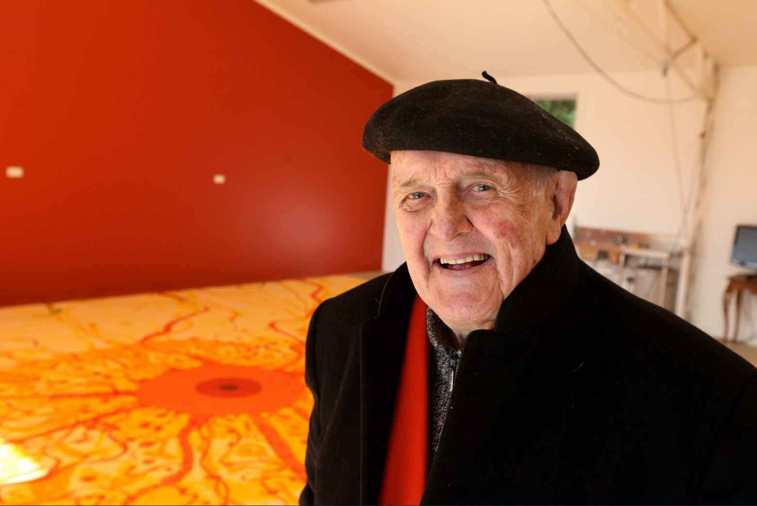
Revered Australian artist John Olsen, with his work King Sun.
Olsen’s aged mottled face becomes boyish, radiating his joy in this outrageously ambitious work as he sweeps brushes across the surface of eight huge panels on the floor or bangs the paint down on them, forcing it to do his bidding. But while the singing spirit was willing, the flesh was weak. He had to be supported through much of it and he became exhausted and collapsed, though still laughing, joking about “swinging by” the mural in the ambulance to put his signature onto it before it’s too late.
Filmmakers Tony Williams and Anna Hewgill’s 54-minute documentary captures each day’s progress, starting with the arrival of the huge blank panels to the empty studio. There are interviews with Olsen’s son, Tim, with his old friend Barry Humphries and others, and Olsen himself shares his philosophy of life, reflecting on mortality, the creative process and the sun itself.
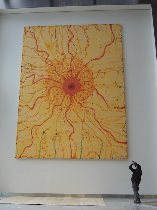
The King Sun by John Olsen, 6m x 8m, commissioned by Lang Walker for Collins Square.
The King Sun now graces the foyer wall of a Docklands high rise building, bringing cheer to all those who enter – as does this film, which is as joyful, energising and uplifting as the man himself.
Garry Shead’s carefully premeditated work is very different to Olsen’s. This idiosyncratic documentary, In the Steps of Lawrence, takes us on a very different trip – starting in New Guinea, where Shead first came across a book of letters by D.H. Lawrence and became fascinated by the man, his beliefs and, above all, his time in Australia, when he wrote Kangaroo. Shead found out all he could about the British author, and embarked on a series of paintings focussing on Lawrence’s sojourn at Thirroul with his wife Freda in 1922.
Garry Shead, D.H. Lawrence series, Le dejeuner sur l’berbe; oil on board, 1992, 91cm x 121cm.
The series, painted in the 90s, starts on the ship that brought the couple over: Lawrence wanted to flee a Europe devastated by war (he foresaw the second rise of Germany, and World War II) and without any real motive, ended up in Australia.
There is a sexy and fantastical quality about the vibrant, colourful paintings, which feature exaggerated figures of Lawrence and his wife seeming to fly, the ubiquitous kangaroo sitting in various postures, or inter-acting with a mythological, even God-like authority. Narrated by Jack Thomspon, In the Steps of Lawrence reveals Lawrence’s fascination with the landscape, the classless society and, weirdly, Australia’s ‘Secret Army’, a bunch of volunteers, many of them ex-Diggers. It’s still a controversial thesis, but Shead believes that Lawrence met many members of this anti-communist militia, including its charismatic leader Rosenthal, the Kangaroo himself.
Through historical footage, mock re-enactments, interviews and close-ups of this fabulous series, In the Steps of Lawrence tells us a lot about the painter, about Shead as an artist, and about Australia.
North Coast artist Scott Trevelyan works on a smaller scale, but with the same focus and purposefulness, and a most unorthodox style, collaborating as he does with bees (yes, bees!) to create beautiful nature-infused prints. The festival film The Man Who Works With Bees is an absorbing documentary about Trevelyan and his unique methods.
Scott Trevelyan in action with one of his ‘hive’ art works.
After creating an image through a process known as ‘relief print-making’, Trevelyan secures it to a wire frame and inserts it into the bee hives, then uses the honecomb they create in the final artwork. It’s random, he never knows what to expect, and he is always surprised by the result. Trevelyan has been a bee-keeper for 20 years – as long as he’s been an artist – but the avian collaboration is more recent, following a severe motorcycle accident in 2002 which left him with a brain injury.
It took him a year to learn to walk again and as part of his recovery, Trevelyan found that both his art practice and the calming bees were highly therapeutic – the combination of the two providing him with a new way to practice art, and in which to see the world. “I found the repetitive nature of printmaking very cathartic and almost meditative,” he says. Trevelyan runs regular workshops for people with ABI (Acquired Brain Injury) at his Willowbank Sutdio in Alstonvale, not far from Lismore. ( scott-trevelyan.com)
The Byron Bay Film Festival runs from March 6-15, with screenings in Byron Bay, Ballina, Lismore and Murwillumbah. Program and ticket sales available from Monday, February 23 at venues and www.bbff.com.au
The post Here comes the sun king, here comes the sun king… appeared first on .
]]>The post Artistic tension of two worlds appeared first on .
]]>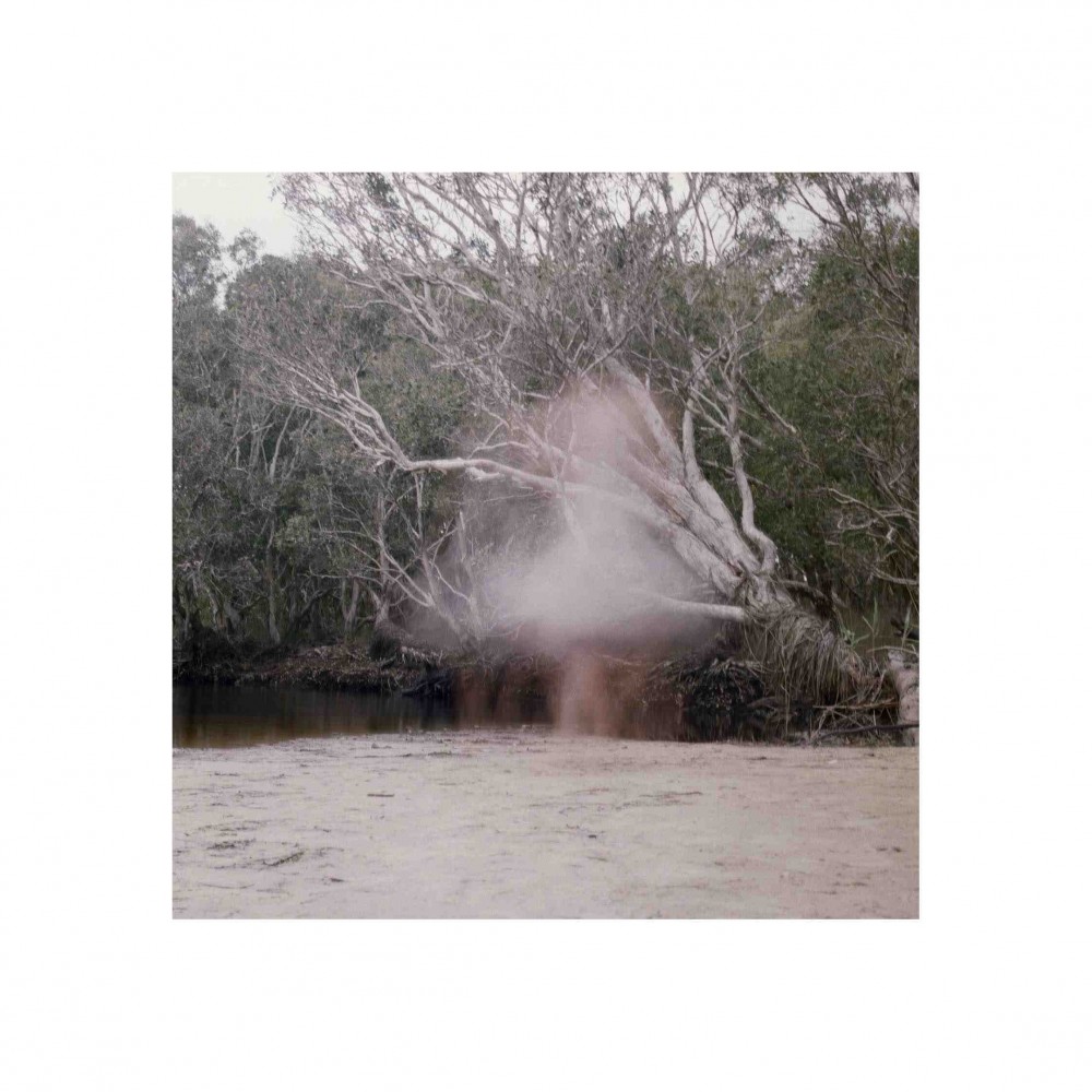
A ghostly moment by Byron Bay’s tea tree lake – from the book Time Out of Place. Photography Rosie Sherwood
Indie publisher and book artist Rosie Sherwood knows what it’s like to live in two worlds – even though she is based in the UK, her love for Australia began at the tender age of two.
Rosie Sherwood always knew she wanted to be an artist – what she didn’t know was what kind of artist. It wasn’t until she was working on her MA in Book Arts at Camberwell College of the Arts in London, that she began to realise that outside of the mainstream art and book worlds, a whole Indie universe exists.
“Artists book fairs really opened a world of community and conversation around art for me,” says 28-year-old Sherwood. “There’s a vast community of people at book fairs who have all looked at the changing art world and the suffering industries and rather than seeing the disaster they’ve seen the potential for something new.”
Book artist Rosie Sherwood with one of her adapted comic books. Photograph Lauren Fried.
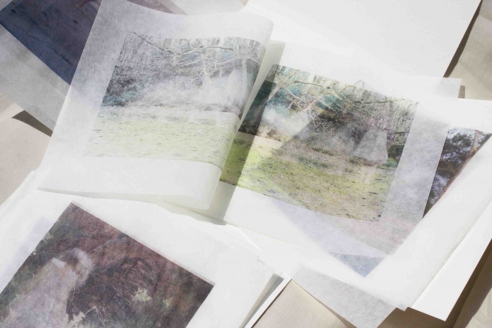
As a child, Sherwood straddled two worlds – England, where she grew up, and Australia, her father’s country – where many of her family and friends live. It’s this dichotomy of where we are and where we might want to be, that has informed much of her work, including the beautiful and wistful Time Out of Place, a limited first edition of 25 books, with half the photographs taken around England, and the other half from a trip to Australia during the course of 2010/2011 – including a ghostly image from one of Byron Bay’s local tea tree lakes. (See top)
“The books were made up of loose-leaf pages collected together in a folded box,” Sherwood says. “The idea is that readers can move the pages around – changing not only the order but what you see through each image because the paper is slightly see through. Most of the pages are single sheets, but some are folded so you open them as if you’re turning the pages of a book. The book is a visual exploration of belonging in two places, and of being between the two – it’s about as autobiographical as a series of pictures can be.”
Dyptich England, from Time out of Place
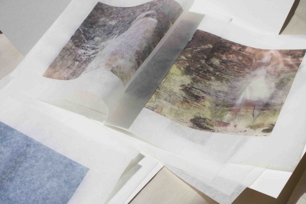
Dyptich Australia from Time out of Place
Having identified that ‘book art’ was her calling, Sherwood has set about combining her two passions for words and images – and space – in a major way. She’s already produced a number of books, including an on-going arts journal Elbow Room. Each of her books is self-produced, printed in her studio and hand-bound. Some are housed at Tate Library and Archive, Chelsea College of Art and Design, The National Gallery of Scotland Library and The Poetry Library or sold at Foyles and thebookartbookshop.
Her next project, The Ellentree, had its genesis many years ago – born from that very under-rated creative impulse – boredom. “I was at my grandparents house one summer many years ago and I was really bored,” she recalls. “For some reason I decided to make white origami cranes and hang them in their apple tree. As the years passed an idea grew, the birds became coloured, the tree evolved into twisted copper – I wrote my story, and Evelyn began his search for the Ellentree.”
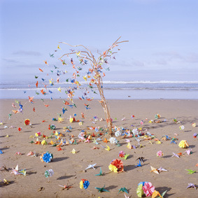
The Ellentree
‘Evelyn is pursuing a trail of fallen bird-leaves from the mystical Ellentree. He must find it or be lost forever.’
The Ellentree tells the story of Evelyn, a young man with an eye of red and purple who walks in two worlds. One is our own; the other, a world of brilliant yet terrible extremes, a place of blurred edges sharp to the touch. To find his way back to our reality, and to the one person who knows he is missing, Evelyn must pursue a trail of leaves – a technicolour flight of birds fallen from a mystical tree. His quest is to find the Ellentree, or be lost forever.
The idea for the story came to Sherwood in the summer of 2009 when she was reading a biography of Neil Gaiman. “I came across the 24-hour comic book challenge, originally created by Scott McCloud as a creative exercise and completed the first draft of The Ellentree in 24 continuous hours.
Sherwood worked on The Ellentree for a year, handing it in as her graduate project and imagining that it was complete, but Gaiman continued to be an inspiration. She sent him a copy of the original book, and his response inspired her to keep working. “I absolutely treasure the meetings and conversations I had with Gaiman,” she says, “they were a major stepping-stone in the path that has led here.”
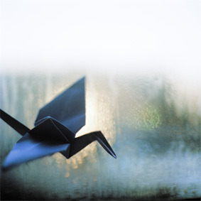
An origami bird in flight…
The ‘here’ she refers to is to her latest quest – inspired by Amanda Palmer, Sherwood has set up a kickstarter crowdfunding appeal in order to complete her project. “To do it justice, to make this book the beautiful object I dream of, I need professional printers and binders this time around,” says Sherwood.
Sherwood says The Ellentree, named after a childhood friend, who would constantly chastise the teachers at their school for wasting paper, is many things. “It’s a short story, a comic book, a poem and a piece of book art,” she says. “However you look at it, at its heart, The Ellentree is a story told in words and pictures.”
You can support Rosie Sherwood here: kickstarter.the-ellentree
You can see more about Rosie here: .ayupublishing
You can follow her blog here: rosiesherwood
The post Artistic tension of two worlds appeared first on .
]]>