The post Horses and humans – and the shadows between appeared first on .
]]>There’s something so enticing about the drive to The Channon. Enveloped by green rolling hills, the small village offers visitors an eclectic offering of outings – from bushwalks up to Protestor Falls in the Hills, to the much-loved Channon market on once a month.
For its size, The Channon punches well above its weight in the art stakes with its beautiful Teahouse gallery in the tiny village, and with a large population of practising artists.
Artist Andi Neilands had a change of direction a few years ago, when she left behind a long career at TAFE teaching IT and 3D modelling and animation to study art. This show, Virtual Shadows, is the result of her advanced diploma with an emphasis on light and shadow to create edges, form and volume.
It’s a cohesive exhibtion – it could perhaps be called humans and horses, since the works are of men, women and horses. But it’s the women who have the relationship with horses, the men are incidental and somewhat exterior to the main body of the work. If a shadow of Neilands former career shows itself, it’s in the precise techniques she’s used to replicate the works in various media, so that a drawing becomes a painting, becomes a bronze. (Many of the works are available as prints or reproductions.)

Ken J – 40 x 20 x 20, ceramic and glaze.
One small area of the exhibition concentrates on one peson – artist Ken Johnson cialis 20mg prix who acted as a personal mentor to Andi – particularly whilst she was coming to grips with the art of sculpting. Johnson is portrayed in a bust and on paper, and Neilands pays tribute to Johnson’s emotional depths in all three works.

‘Bucephalus’, white Carrara marble, 40 x 30 x 20cm, $4000
One of two of the most expensive work in the exhibition, a bust of Bucephalus, Alexander the Great’s warhorse, is carved out of white carrara marble from the Michelangelo quarry. It has an almost transluscent quality, and the proud horse’s head takes an easy pride of place. Interestingly its ‘shadow’ are smaller heads printed in plastic by 3D printing. From the most natural, to the most unnatural material on the planet. Both, these days as seemingly durable as the other.

‘RUOK?’ 20 x 15 x 10cm, ceramic figure, woman and horse. $350.
The messages behind the mediums are subtle. Less subtle but interesting to a fellow horsewoman, are the works depicting the sometimes almost erotic, always highly emotional relationship between women and their horses. My personal favourite is a small clay maquette of a horse lying down a woman sitting by its stomach with her head on her lap, and the horse’s head gently turned towards her. The title of the work is RUOK? and for me it’s a reminder of how, although as a human it’s my job to look after my horse, every now and then in my dark days my horses have turned to look after me.
The imperative for an artist behind a work of art is always fascinating. As the viewer what do we see? As the artist, what did the creator intend? Perhaps the most personal of all is a bust of Neilands’ father – My Father, My Hero – drowned at sea in a boating accident in 1957 having saved the lives of Neilands, her sister and her brother. The bust of her father held great emotional signifcance for the numerous descendants of the tribe at the opening – reinforcing the notion that in any form of art it is the story that is contained within it that is the emotional connection to the outside world.
I will be interested to see the expansion of this artist’s work.


Virtual Shadows is showing at The Channon Teahouse & Gallery in Standing Street until December 10.
For more information on her works go to andineilands.com or contact Andi on [email protected]
The post Horses and humans – and the shadows between appeared first on .
]]>The post Coffs Harbour Regional Gallery STILL finalists announced appeared first on .
]]>“We’ve been bowled over by the number of entries and their variety,” says Gallery Curator Jo Besley. “Changing the Award to welcome entries in all media has opened the doors to a much wider field of artists working in all types of contemporary still life. It’s exciting to see that STILL has – in its very first year – been recognised as an important and nationally significant opportunity for artists.”
The overall winner will receive $20,000 and the winner of the People’s Choice Award will take home $5,000. Local Coffs Harbour sponsors support the award. Mercedes Benz Coffs Coast is the Major Sponsor alongside Supporting Sponsors Slater & Gordon, Saso Creative and Moving Art.
A total of 63 artists have been shortlisted. The selected artworks include painting, drawing, photography, printmaking, ceramics, glass, sculpture, video, printmaking and textiles.
The 2017 finalists are: Tony Albert, Louise Allerton, Kelly Austin, Tanya Baily, Elie Begg, Annette Blair, Rene Bolten, Mechelle Bounpraseuth, Terri Butterworth, Fran Callen, Tom Carment, Angela Casey, Tiffany Cole, Karl de Waal, Trisha Dean, Mary Donnelly, Scott Duncan, Sarah Edmondson, Nicolette Eisdell, Merran Esson, Ben Fayle, Guy Gilmour, Sarah Goffman, Ronnie Grammatica, Linda Greedy, Colleen Greig-Canty, Vanessa Holle, Alana Hunt, Susan Jacobsen, Laura Jones, Helle Jorgensen, Paul Kalemba, Laura E. Kennedy, Myriam Kin-Yee, Zai Kuang, Michael Langley, Sam Leach, Kellie Leczinska, Alison Mackay, Josh Mackenzie, Kiata Mason, Julian Meagher, Robert Moore, Stephen Nothling, Susan O’Doherty, Sarah O’Sullivan, Sassy Park, Victoria Reichelt, Elvis Richardson, Damien Shen, Brendan Smith, Tim Snowdon, Richard Spoehr, Vipoo Srivilasa, Nathan Taylor, Samantha Thompson, Anselm van Rood, Prue Venables, Lilli Waters, Kati Watson, Greg Weight, Mirra Whale and Cleo Wilkinson.

Richard Spoehr: Between Mind and Material, 2017. Handmade porcelain, metal found object / group of 3D objects. Courtesy of Stella Downer Fine Art.
The shortlisting panel comprised Director of Lismore Regional Gallery Brett Adlington, Sydney art collector and former board member of the Museum of Contemporary Art Lisa Paulsen, along with Coffs Harbour Regional Gallery Coordinator Cath Fogarty and Curator Jo Besley.
The award itself will be judged by Lisa Slade, Assistant Director Artistic Programmes, at the Art Gallery of South Australia.
The exhibition will be on show from November 24 2017 – January 18 2018. The official opening will be Saturday November 25 2017. People’s Choice voting begins on Thursday November 23, 2017.
Media Contact: Sara Hinds, Senior Communications Officer, 6648 4093/0407 227 818
Council Online: www.coffsharbour.nsw.gov.au
The post Coffs Harbour Regional Gallery STILL finalists announced appeared first on .
]]>The post Byron Bay’s Jonson Street Lane will soon be popping with POPPED appeared first on .
]]>Commencing May 12, a team of Byron Bay’s most talented street artists will transform ‘Surf Alley’, the laneway in Jonson Street that – despite its murals honouring local surfers – has often been used as nothing more than a pedestrian thoroughfare and hot spot for late-night anti-social behaviour.
The celebration of the space reinvigoration will be an urban laneway activation event, encompassing live art, street food, bar, music, cool lighting, green walls, bespoke sustainable furniture, Live Ideas Program, and much more.
The event creates a platform for emerging artists who would not otherwise have an opportunity to engage with the local community. The Fresh Air Gallery is a live street art gallery that will auction the finished artworks on Instagram at the end of the night, raising money for the Byron Community Theatre’s much needed upgrades.
The project aims to revitalise the beloved ‘Surf Alley’, breathing new life into it, whilst honouring the legacy. “We are in direct and regular consultation with members of the honour roll, and working to achieve something new and exciting for the whole community, as well creating ways for new residents and visitors to learn more about Byron Bay’s surfing history, and ensure those stories are given a platform,” say operations manager, Monique Hartman. “We’re also using our Live Ideas program on the Saturday afternoon to use this opportunity for young and old to engage and learn about community together, through art and the power of story.”

Fresh Air Walls – part of POPPED
Popped artists are:
Nitsua // Jeremy Austin // Burg // Shmik // Basix // Sean Lemura (Set design & building) // Nikau (Greenery)
The Popped team is committed to social and environmental responsibility. Local supplier Paint Earth has donated paints that are eco-friendly and non-toxic, and the event has a zero waste policy. Go Byron and Steer group are working with the event to promote responsible drinking and getting home safe.
The full program will be distributed throughout the region via Media partners The Echo on 10 May.
OPENING NIGHT – FRIDAY 19 MAY
5PM – 11PM // 18+ only event, and fully licensed. BYO not permitted // $10 entry
Live art
Live DJs
Green walls courtesy of Niaku Byron Bay
Bespoke built furniture courtesy of SL Byron Bay
Street food courtesy of Three Blue Ducks
Bar co-hosted by Stone & Wood Brewery, Brookie’s Gin, and Bucha of Byron
New mural reveal
New honour roll reveal
LIVE IDEAS PROGRAM – SATURDAY 20 MAY
12PM – 3PM // All ages // $10 entry
12:00pm Welcome drinks hosted by Bucha of Byron
12:30pm Placemaking: The history and future of Byron
1:00pm Expression and Freedom: The Street Art Movement
1:30pm Surf Alley: Stories from the Honour Roll
2:00 pm Art, healing, and well-being
2:30pm Being Bold: Exploring Creative Courage
Panellists include Cr. Simon Richardson, Rhoda Roberts, Sarah Workman, Rusty Miller, Peter Woods, Andy Mac, Leanne de Souza, Feather, and many more still to be announced.
CLOSING NIGHT – SATURDAY 19 MAY
5PM – 11PM // 18+ only event, and fully licensed. BYO not permitted // $10 entry
Live art
Live DJs
Green walls courtesy of Niaku Byron Bay
Bespoke built furniture courtesy of SL Byron Bay
Street food courtesy of Three Blue Ducks
Bar co-hosted by Stone & Wood Brewery, Brookie’s Gin, and Bucha of Byron
Tickets are $10 each, per person per session, and can be purchased via www.poppedcreative.com or at the door. For an additional $5, ticket holders can purchase a return bus ride, thanks to GO BYRON from outer suburbs Lennox Head, Bangalow, Brunswick Heads & Mullumbimby. Limited seats available.
Traffic conditions will change for the duration of the event. No motor vehicle or cyclist access to the south entrance of the Lawson Street carpark from 12am Thursday 18 May until 9am Sunday 21 May
More information:
Facebook.com/poppedcreative
Instagram @poppedcreative
Artist and media enquiries:
Abbie Gibson 0411 215 296 // [email protected]
Operations enquiries & Partnership opportunities:
Monique Hartman 0410 759 465 // [email protected]
Popped is produced in partnership with Byron Shire Council as part of the 2016 – 17 Placemaking Seed Fund.
The post Byron Bay’s Jonson Street Lane will soon be popping with POPPED appeared first on .
]]>The post Tea with the Colourman appeared first on .
]]>Early in the 90’s, David Coles moved from England to Australia bringing with him his passion for pigments, his expertise in art supplies and his youthful determination. What he could not know at the time though is that this red continent would offer him something most unexpected and surprising: a desire for new colours.
David’s first factory’s location – on Langridge Street – gave his company its name and, despite rather what he laughingly calls “bohemian” beginnings, hard work and excellence always flourished there. Manufacturing professional quality oil mediums, varnishes and grounds to supply artists with artist grade dry ground pigments and other quality raw materials kept David happy and busy for nearly two decades.
But being the invisible medium of the oil paint world was not his long term dream. Urged on by artists who told David they wanted a paint of the same quality as his mediums, Langridge’s Handmade Oil Colour finally came on the market in 2011. The company started its foray into paint modestly, with 32 on the initial production line, and eight extra added 18 months later. That was only three years ago, and last year they added 16 new colours, with the intention of having 80 colours on their final list.
This May, David is celebrating the first quarter of a century of his ‘young’ company – young in the colour world that is – with a delightful exhibition about pigments, colours and paint making, Chromatopia, opening at Tacit Contemporary Art space in Melbourne on May 31.
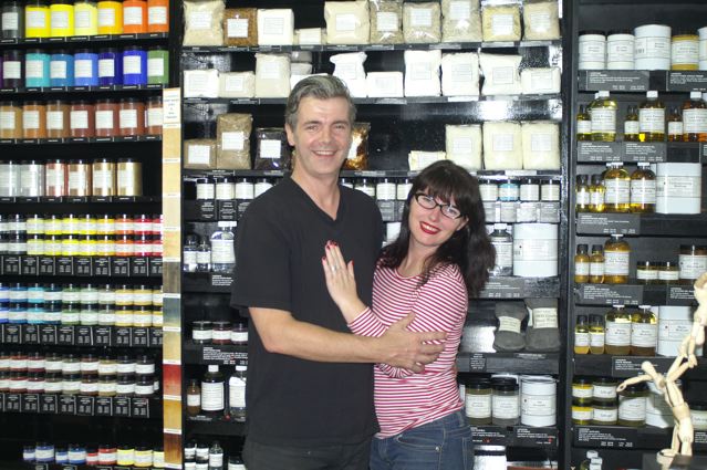
Master Paint-maker David Coles and his artist partner Louise Blyton.
In a perfect match for a paint-maker, David’s partner Louise Blyton is an artist who runs an art store in Melbourne – full of all the Langridge products and the Golden acrylics David distributes here in Australia. Their enthusiasm for their projects and creations is infectious – and I’m increasingly intrigued, as they talk about their love of paint, about the title of Master Paint-maker. It certainly isn’t an honour bestowed on everyone. David tells me that the name reflects the dedication involved with the formulation of paint from scratch. “Being a Master Paint-maker as well as the founder of Langridge Artist Colours, I’ve grown very sure about following my philosophy of what paint should be. For me paint should not only have the highest pigment load possible to so that artists can get as much colour of the paint as possible, but it should also have a certain feel,” he says.
As he describes the quality of paint, it sounds almost like a chef describing a cooking method or food. “The paint is going to be reflective and honest about the way the pigment actually is and creates certain qualities. You have some colours that are naturally soft and quite fluid. Some which are quite buttery,” he explains. “Some are quite stiff, some clotted. It’s the pigments’ action upon the vehicle used creating that. You don’t see that with most of the other paints out there because they use some additives, mostly stabilizers, in quite large quantities which, in essence, homogenizes and evens out the natural qualities of each colour. I think that a pretty important part of an artist’s craft is understanding how paints operate slightly differently from colour to colour because they reflect what the pigment is actually all about.”
Despite the title however, it’s not exactly a degree you can go somewhere to obtain. This title is really learned on the job. “There’s nowhere you can go and learn to become a Master Paint-maker,” says David. “I learned a lot of my craft when I went to work for Roberson & Co. back in London in the 80’s, but in the end, I really learnt it on the mill. When you’ve got wads of colour coming at you from the triple roll mill, you start to learn. For example, with modern colours where you have to tease the colour, the pigments need to be separated from each other much more gently whereas the older inorganic pigments, like the Cadmiums and the Cobalts, are much easier to disperse – and something like Zinc White, which is a very soft pigment, needs hardly any work done to it to actually make it into a dispersed paint. And when we talk about dispersion, I’m talking about separation of the pigment particles evenly throughout the actual vehicle so that all the pigment particles are separated from each other and coated evenly in the minimum amount of oil possible to make it into a paste. Which is what we call paint!”
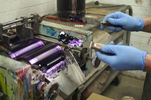
The process of making paint at the Langridge factory.
If there is a range of colours that are perhaps more difficult than others to work with, it’s the earth colours. “Some of my children are very obstinate,” David laughs. “The Umbers are very naughty. They’re thirsty pigments so they need a lot of oil. Our Siennas are naturally of a gritty consistency and that’s not because we’ve under-milled them but because that’s the nature of Sienna pigments. The Earth colours, because they’re naturals, have their own real individual qualities.”
I’m intrigued by the use of the word ‘our’, but as David explains he now has long term relationships with the major pigment manufacturers around the world. “I buy from the Germans, the British, the Americans, the Taiwanese, the Japanese, and we select pigments that are built to the specifications we need as artists. The most important factor is that they are not reactive with other painting elements, like solvents, that there is no solvability etc. and that they are highly lightfast. Also that, when they are dispersed, they have a working quality that makes a paint artists can work with,” he says. “There are now a lot of pigments available that are surface coated. For example, these days most Titanium White pigments have some kind of surface treatment which allows it to be dispersed in different types of vehicles for different applications. We’re offered a vast variety of them and so we have to be ultra careful about what we choose. It would be very easy for someone to be waylaid and pick the wrong pigment. You have to know a fair amount about chemistry. Not that I’m trained as a chemist, I trained as an artist. So my starting point is always – are these colours artists will want to use?”
Originally David had imagined that he would become an artist. “In fact,” he says, “I don’t think I had any doubts about that – actually I still am an artist. I have a studio, I still go in the studio although not as much as I used to, but my art informs very much what and how I make the things I do. Also my conversations with fellow artists don’t stop at selling them or supplying them with materials, it’s a constant ongoing conversation. All my friends are artists. I go to their studios, gallery openings, and over dinner at home we might start talking about their painting. I’m very open to helping artists because it feels, naturally, the right thing to do.”
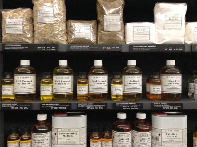
Mediums of all kinds – but always of the highest quality – all made with non-yellowing Linseed Oil.
His Australian career came about by accident when he first visited Australia on a holiday while he was working for an art retailer in the UK. “I became aware of what was available to Australian artists. Obviously there were a couple of Australian manufacturer’s brands here. Having worked for Roberson & Co. and in their venerable art materials store in London, Cornelissen & Son, I knew a lot about art materials and the benefits/negatives of each raw material that goes into a manufacturer’s formulations and products.”
One of the biggest issues for David remains the use of linseed oil, which he uses as a binding oil for paint. “It’s magnificent,” he says, “but obviously it’s kept to an absolute minimum because used excessively, particularly in mediums, it promotes yellowing. The mediums that I could see here were basically, unfortunately, detrimental to the artists’ practice. So that’s why all of the Langridge’s fluid mediums are based on stand oil – polymerized linseed oil because it’s a non-yellowing oil. So I very quickly realised there was a gap in the market for a world-class medium for artists. Before I came back out here, I knew what I was going to do: set up an artists’ products manufacturing company in Australia. Even then I knew I wanted to make paint.”
David began his company by formulating mediums, rather than the more usual manner of creating paints for the simple reason that it was all he could afford to do at the time. “It took me seven years to be able to slowly find and buy all the machinery needed to start making paint,” he tells me. “The first mill I bought was a small mill. We still use it in the factory to make very small batches and often now trial batches. But it took me many years to be able to afford to get to that stage. So I started making oil paint mediums, which I formulated myself from scratch, again knowing what I wanted to get out of a medium for myself and what I knew was important for artists.”
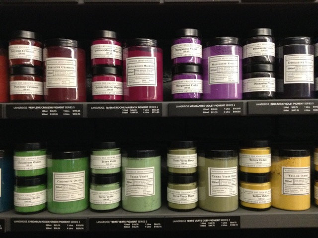
Listening to David describing paint and pigments is fascinating. “Of course,” he says, “pigment is pure colour. Some disappear and we introduce more colours but, as a general rule, we stock and sell about a hundred pigments here because some artists want to make their own paint and because they are so delicious in their nature as pure colour. In the paint something has already been denatured. It’s colour with a binder and depending on the binder, it can alter the optical vibrancy of the paint. Ultramarine is a classic. You can see the pigment vibrate but when mixed with oil it becomes very dark. You have to add white to it to start to see that light come back into it. I’ve always been in love with pigments anyway. I remember when I was around eleven and my mother had opened up an art shop in Henley where I grew up, and one Christmas she gave me a set of pigments, just little 30ml pigment jars and it was for nothing else except to be able to look at them. Like jewels.”
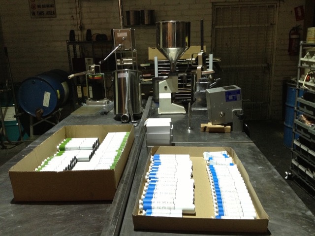
Empty tubes waiting to be filled with Langridge paint.
David has also always been interested in the history of art materials. “I’ll experiment by making something using a 14th or 15th century recipe… at the moment I’m making a traditional walnut ink made from their husks,” he says. “They’ve been fermenting in the pot for about two years now and the fermentation breaks down the sugars which creates a darker colour. I’ve also made a whole set of traditional lake colours from dyes. Things like Brazil wood and turning it into pigment and in the same vein I want to make some genuine madder but these are not commercial exercises this is purely out of curiosity and to understand I suppose how pigments used to be made and probably from that realise over again how incredibly lucky we are now. I’ve always been a big believer in this idea of science and art, technology and art actually, working hand in hand. I mean the history of technology is always written out of the history of art in regards to why artists started to paint in a particular way. Often it has to do with a technological breakthrough not an aesthetic or cultural breakthrough.”
What David is constantly striving for is a quality of paint that can compete with the best in the world. And that, in turn, feeds into his desire to create paints that reflect Australia. “Do I think there’s room in the world for another paint? There are already quite a lot of brands out there,” he says, rhetorically. “Where I think Langridge can make a difference is because of my interest in these modern highly chromatically intense colours. Creating a palette that reflects the Australian light in a way that light floods and energises the colours that it strikes and which comes from the dryness of the continent. There’s very little moisture, there’s very pure light and the scale of the skies are enormous. It doesn’t really afford the opportunity for much shadow. And when you do get shadows, the shadows vibrate as well. They become violet and vibrate that way.”
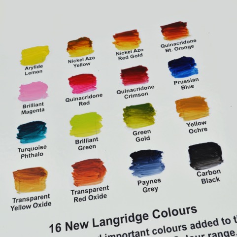
Sixteen beautiful new colours – designed to capture the Australian light.
He is determined to offer an Australian palette in his range. “I suppose for example, that Zinc Blue attempts to fill the colour space that used to be filled by the old Manganese Blue which is a pigment that has not been in production for almost twenty years,” he says, “and that particular blue is very relevant to the Australian sky and Australian water, especially ocean water which has that kind of brightness and again that lack of moisture, or perceived lack of moisture to the eye because of the blueness of the sky as it strikes a liquid material! It’s the same with our Cold Brown Oxide. It’s a blend that replicates a colour very useful for artists, an old colour that was Cassel Earth or Van Dyke Brown. Those pigments unfortunately have strong problems with regards to drying rates, they’re very erratic. So, once again, I wanted to create another blend for this colour so useful to artists in particular for creating receding shadows, etc. without those drying problems. Of course as we go to the 80 colours, yes there is going to be more blends. And then I’ve got to be extremely careful about why I’m making them. That’s why I’m interested in what we call our brilliant range. We already had Brilliant Pink, which is almost like a hot bubble gum pink and have proceeded with a Brilliant Magenta and a Brilliant Green and we’ll continue to expand that range. The philosophy of that range is to offer the kind of vibrancy of a fluorescent pigment, but highly lightfast. So, again, these non-real or unrealistic colours are there because I know artists find them very useful.”
Talking with David it’s easy to feel that there was a sense of destiny to his arrival in Australia and to his career. “Langridge did have a sense of destiny unfolding,” he agrees, “a whole set of coincidences, accidental meetings, that led to me very easily settling here. And it’s interesting about you mentioning it being an old continent because Australia is of course the oldest continent with the oldest continuous civilisation in the world, and it’s something that I’ve thought long and hard about in regards to Langridge: what is our relationship with that part of Australian culture? I’m not working with a traditional aboriginal palette but we have a lot of aboriginal artists who buy our pigments and some of the very bright colours. At this point in time though, most of the indigenous artists I’m connected with work in acrylic paint not in oil. So there isn’t immediately some kind of connection to the actual materials. For the pigments we have a constant interaction and dialogue with communities West, up North and in the Centre. Our oil paint is not something they are particularly interested in at this moment. Acrylic is probably much more sympathetic to their painting style: waterborne, fast drying.”
The rich colours are almost a painting in themselves…
Which brings us to the question of whether, in this age of fast-changing technologies, something as ancient as oil paint can survive. David is sure it can. “Oil paint is here for the future absolutely. I’ve made oil pastels, oils sticks, compressed chalks, charcoals, gouache, drawing inks, even shellac based ones…I do it more out of a personal interest, a curiosity. I would love to make commercially soft pastels but, again, there is so much to be done with oil paints I’m not quite sure I’ll ever find the time. Not just the oil colours themselves, I’m constantly inventing and formulating new mediums and new products when I see a gap in the market. A possible new tool for painters. I have just developed a more fluid medium, which has a more slippery quality than some of our existing ones, and a high impasto medium. We’ve been experimenting with some glass bead and we’ve just released a new encaustic wax… a modern formulation of a very traditional recipe. Encaustic, at this moment in time, is back in favour. We have a lot of artists interested in working as encaustic artists. All the materials available had to be brought in from overseas but I knew we could produce here a product as good, if not better, than those imported products. And again because I worked with encaustic 20 years ago, and on and off since that time, I do understand the working qualities and what this product needs to be, as a tool for artists. So far the feedback from encaustic artists with lots of experience themselves has been extremely positive. We do believe we’ve created something quite unique. Something we could even launch onto a world market and it fits, of course, beautifully into our pigment colours so in a sense it closes the loop all the way back to the very beginnings of Langridge. 1992 to now. A completion of the first circle really.”
Photographs: Sabine Amoore Pinon and David Coles
Sabine Amoore Pinon runs Still @ the centre, an art store in Byron Bay, and is a fan of great art materials. Check out her supplies here: https://the-centre.com.au She also writes a blog about her interviews with colour men and women all over the world. Follow her on inbedwithmonalisa.com
‘Chromatopia’ opens on May 31-June 18 at Tacit Contemporary Art Gallery – 312 Johnston St, Abbotsford Victoria.
The post Tea with the Colourman appeared first on .
]]>The post Sounds of the sea and the city appeared first on .
]]>In one of John Witzig’s photographs, taken in 1969 at Possum Creek, near Bangalow not far from where I live, a young man is sitting on a rock, in the middle of the creek, poking a stick into the water which is rippling into never-ending circles. This quiet, contemplative image of a young Wayne Lynch, the teenage messiah of the shortboard revolution in the late 60’s and early 70’s, has a sweet nostalgia about it, and yet also a timeless quality. The creek is still there, the surfers still here, it’s not inconceivable to imagine this photograph being taken today. And yet, of course, what Witzig’s photographs, and Alby Falszon’s psychedelic film footage (which accompanies the photographs) do, is to sum up an era.
Looking at the exhibition, originally from the National Portrait Gallery, with an outsider’s eye, what strikes me immediately is the absolute ‘maleness’ of the photographs. This was a time when young male surfers could take off in their Kombi vans, living on next to nothing, and even, according to the surfer Nat Young, believing that: “by simply surfing we are supporting the revolution”. It was long before massive consumerism and marketing hit the sport, and when people-free waves still ruled.
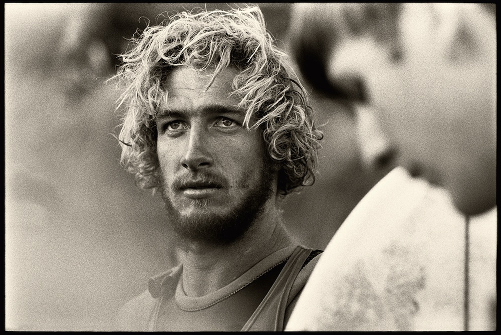
Nat Young photographed by Albert Falzon, 1968.
In Sarah Engledow’s excellent catalogue essay, she too is drawn to the male energy of the photographs. The exhibition, she says, is “about how it feels to be lean, male, strong, untrammelled and irresponsible: to be a slacker with immense discretionary energy.” There is indeed, a kind of winsome innocence to the photographs, and an exultation in the sheer joy of being alive which was part, I think, of the appeal of Tracks, the magazine that Witzig, Falzon and David Elfick first put together one night in a house at Whale Beach in 1970, and which, of course remains the Australian surfer’s bible to this day.
It was an inspired idea of Engledow’s to include another motif within the sounds of the sea – the massive, richly abraded, textural pen and ink drawings by Nicholas Harding of pandanus, that most coastal of trees, and used by generations of Australian beachgoers for shade, for somewhere to stand the surfboards, hang the towels, and stash the esky. These beautifully detailed works perfectly offset the ‘of the moment’ photographic and film works. Harding, originally from England, found solace in his drawing after the family moved to Australia, and has become famous for his textural use of paint, which is sometimes so thick on the canvas it creates an almost 3D effect – an effect also present in these pandanus drawings.
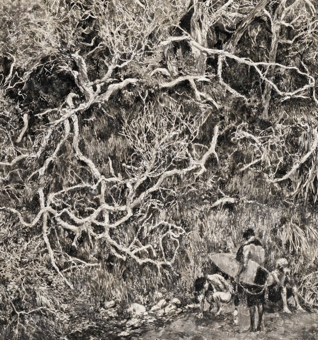
Digger’s Scrub Nicholas Harding. Pen and ink.
Harding’s drawings have a lovely connection to the Northern Rivers – introduced by his partner, Lynne Watkins to the Yuraygir region, near Angourie, and using it first as a holiday place, Harding gradually felt compelled to transform these fabulously messy, complex structures into drawings. Placed with careful intent between photographs, the provide a philosophical sub-plot which touches on our relationship to nature, on our mortality, and on a very different aspect of our relationship to the sea to the sweet simplicity of Witzig’s and Falzon’s photographs.
![PastedGraphic-1[1]](https://www.verandahmagazine.com.au/wp-content/uploads/2015/10/PastedGraphic-11.jpg)
Next door to Arcadia Sound of the Sea in the Boyd Gallery is a very different exhibition – The Same and the Other by local artist Michael Cusack, a body of work which was inspired by a three-month residency Cusack spent at the Cité Internationale des Arts in Paris in 2014.
Cusack, like Harding, is from ‘elsewhere’, emigrating to Australia from Ireland in 1982, and until this exhibition, much of his work has had a strong connection to his homeland, with its never-ending supply of rock walls. Always drawn to shapes, Cusack has used a rock motif almost as a mandala for most of his work, re-working from the most muted of colours, to his later more vibrant works, the relationship between object, space and colour and becoming, in the process, a masterly painter of works that question a sense of place.
The Same and the Other sees Cusack’s normally large-scale works scaled down, a necessity, he says, of working in a tiny studio. The enforced need to rethink how he might portray Paris, has resulted in a wonderful exhibition, with Cusack’s trademark focus on fragments concentrated into an exhibition full of small delights.
Documenting the surface of the city, and collecting materials for his work, Cusack, it seems from this exhibition, dropped into that deep artistic space where inspiration and illumination bubble up to produce something surprising and unexpected, as in for instance, the wonderful piece, The Untold, a series of mixed media in old wide film canisters. The painted inserts give the canisters a contemporary abstraction and at the same time, have an almost negative quality to them, as if someone has dragged a piece of metal across a film.
The Untold. Michael Cusack, 2014.
According to Cusack, in this exhibition he was attempting to make forms that stand for themselves without explicit reference to an image, and yet somehow for the works to hold traces of Paris. He refers to Maurice Merleau-Ponty’s idea that “through attention I shall come by the truth of the object”, and suggests that he is looking for an impossible-to-find visual truth.
Having discarded my initial expectation of ‘big’ paintings, I found The Same and the Other a deeply satisfying experience. For me, having lived in Paris as a teenager, it was evocative as well, the tiny Parisian references creating glimpses of something larger – tempting the imagination to take the leap between the seen object and the remembered place.
I found it fascinating to contemplate all the works in these two very different exhibitions – on the one hand, the almost mystical recreation of a time of innocence in Witzig and Falzon’s work; the intense complexity of Harding’s drawings – all relating to an Australian coastal sensibility and Cusack’s work, in almost exact opposition, the minutiae of an European city revealed by a visitor searching for points of connection. This last, a connection to place, perhaps is also where a relationship exists between all the works in Aracadia the Sound of the Sea and The Same and the Other, whether it was almost accidental as in the cheerful documenting of the early surfing era, purposeful and fanatical as in Harding’s work, or a deeply absorbing process springing from exposure to new influences, as in Cusack’s – all of the works speak ultimately of where we’ve come from, where we’ve been, and where we might go next.
May we all, in our different ways, ride the waves of life.
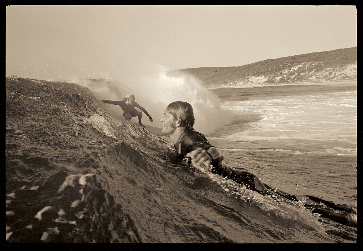
Nigel Coates and Murray Smith, 1972. Photograph: John Witzig
Arcadia Sound of the sea and The Same and the Other are showing at the Tweed River Gallery until November 15. For more information go to: artgallery.tweed.nsw.gov.au
The gallery is open from 10.00 am to 5.00 pm Wednesday to Sunday.
The post Sounds of the sea and the city appeared first on .
]]>